
We’ve been hard at work on an all new Check-in dashboard, and we’re happy to announce that it’s rolling out across Status Hero accounts over the next few weeks. Why redesign?
The Check-in dashboard relied on a “masonry” layout that was popularized by apps like Pinterest. It’s a UI pattern that works exceptionally well for Pinterest, which is less about reading from start to finish, and more about letting your eye grab on to whatever image jumps out at you while you scroll. But in the context of Status Hero, it falls short in two specific ways:
- Reading is challenging. The combination of short line lengths and horizontally stacked cards leads to an excessive amount of eye movement, competing focus, cramped text, and small images (Check out this overview of line-length studies to learn more about how line length impacts readability).
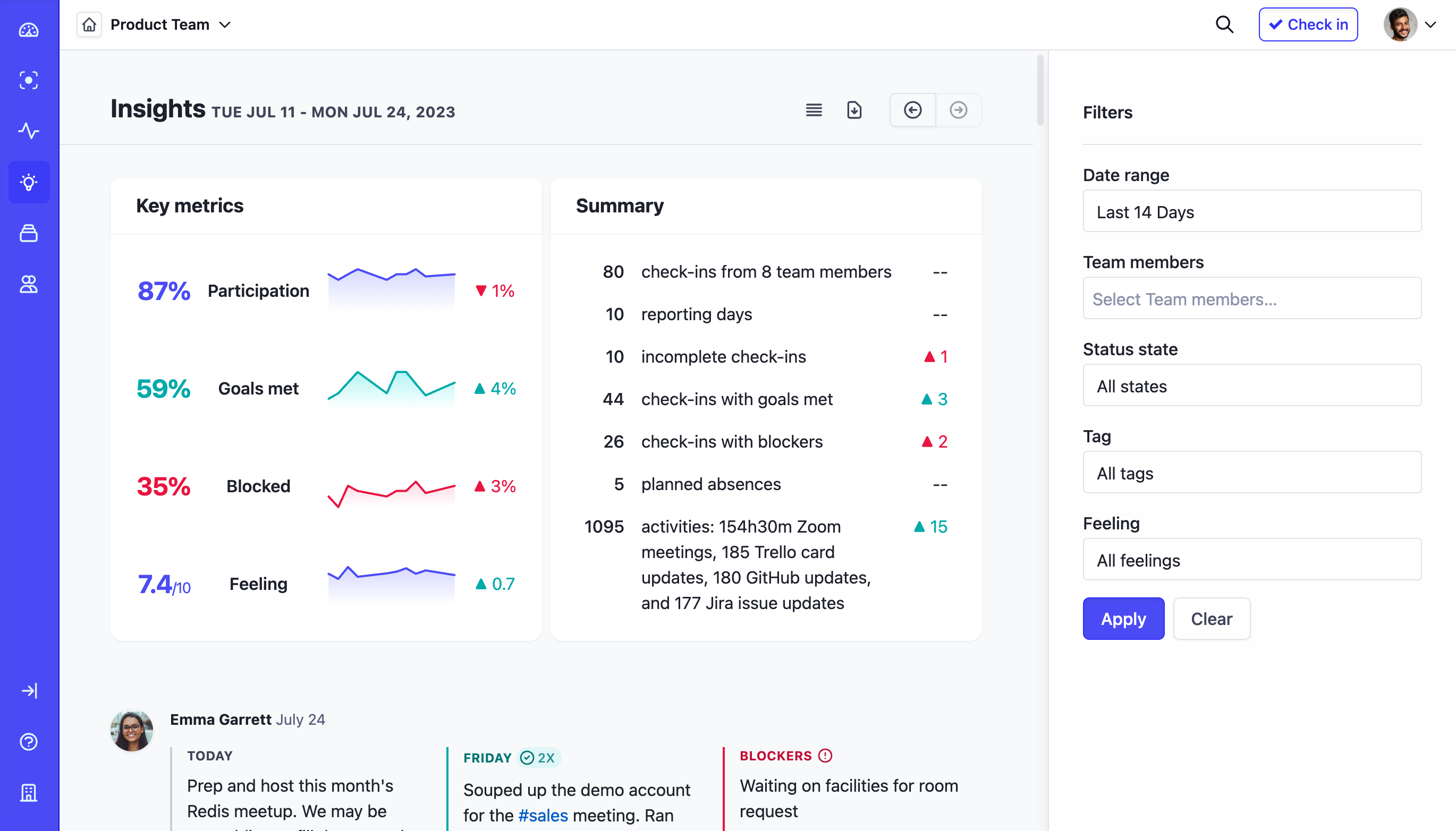
- It’s not dense enough to see status “at a glance”. Unless a team is just a handful of people, you have to scroll to get the gist of who has checked in, who hasn’t, who’s blocked, who’s out, etc.
The new design solves both problems by splitting up the reading and status-at-a-glance jobs. Here’s what it looks like:
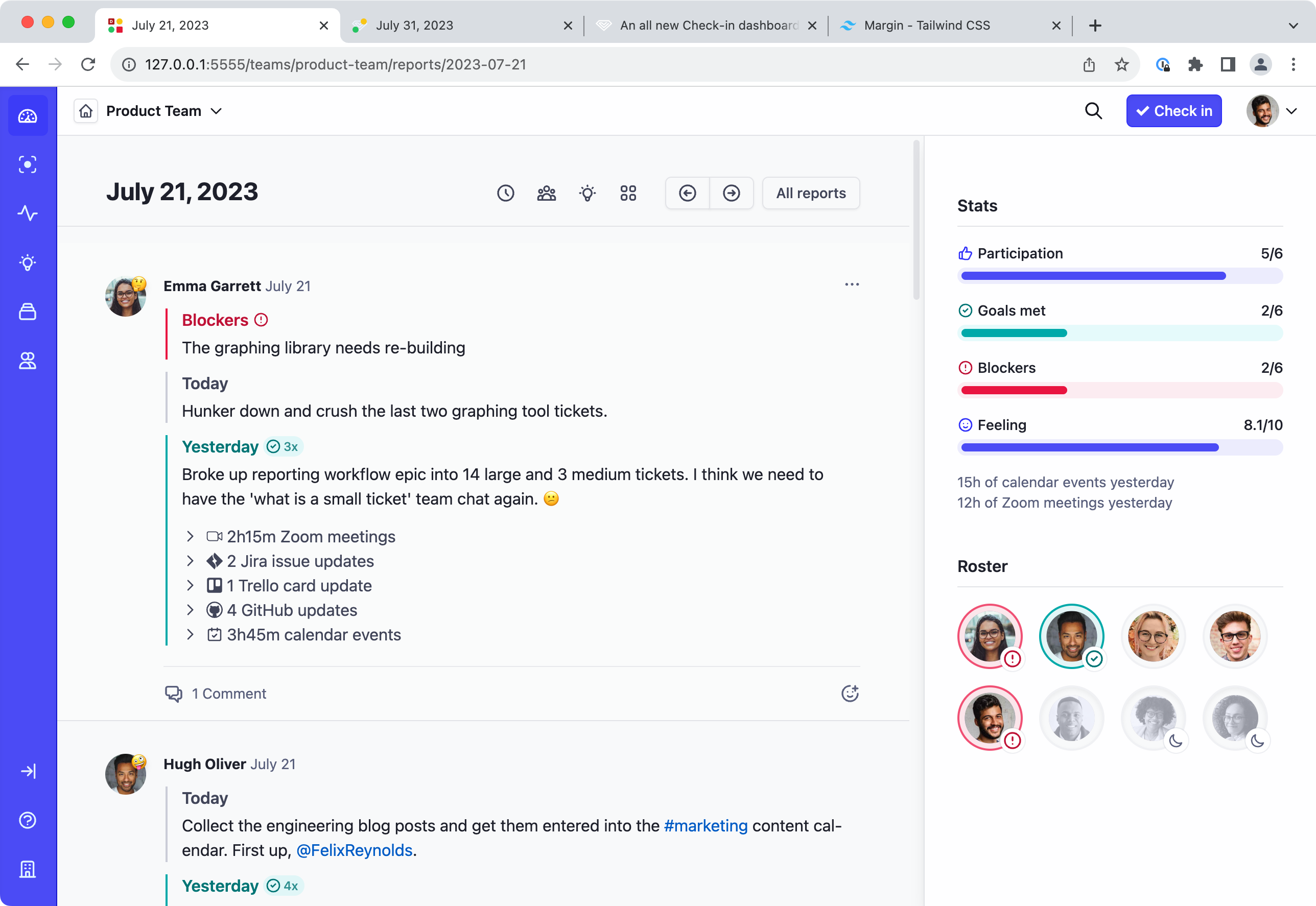
The primary column adopts a feed paradigm that’s instantly familiar if you’ve used any social media platform or chat app in the last decade. It’s an extremely common pattern for a reason; scrolling is a very low-friction interaction, and reading is fast and comfortable across a broad range of device size. In other words, it’s a fantastic UI paradigm for consuming content. We’ve got more plans for feed content in the future; stay tuned.
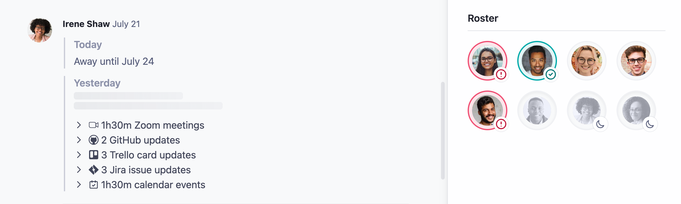
The sidebar takes on the status-at-a-glance job. A stats block displays totals for participation, goals met, blockers, mood score, and meeting hours, and a new “roster” section shows who has/hasn’t checked in, who’s blocked, who accomplished what they intended to, and who’s out. Hovering over an avatar gives you extra information like name, title, check-in time, and mood. Clicking an avatar jumps you to their full entry, making it super quick and easy to dig in.
We also redesigned the alternate grid layout to use the new visual language. This is great view for quickly catching up on a specific content type like Blockers. Just scan down the column.
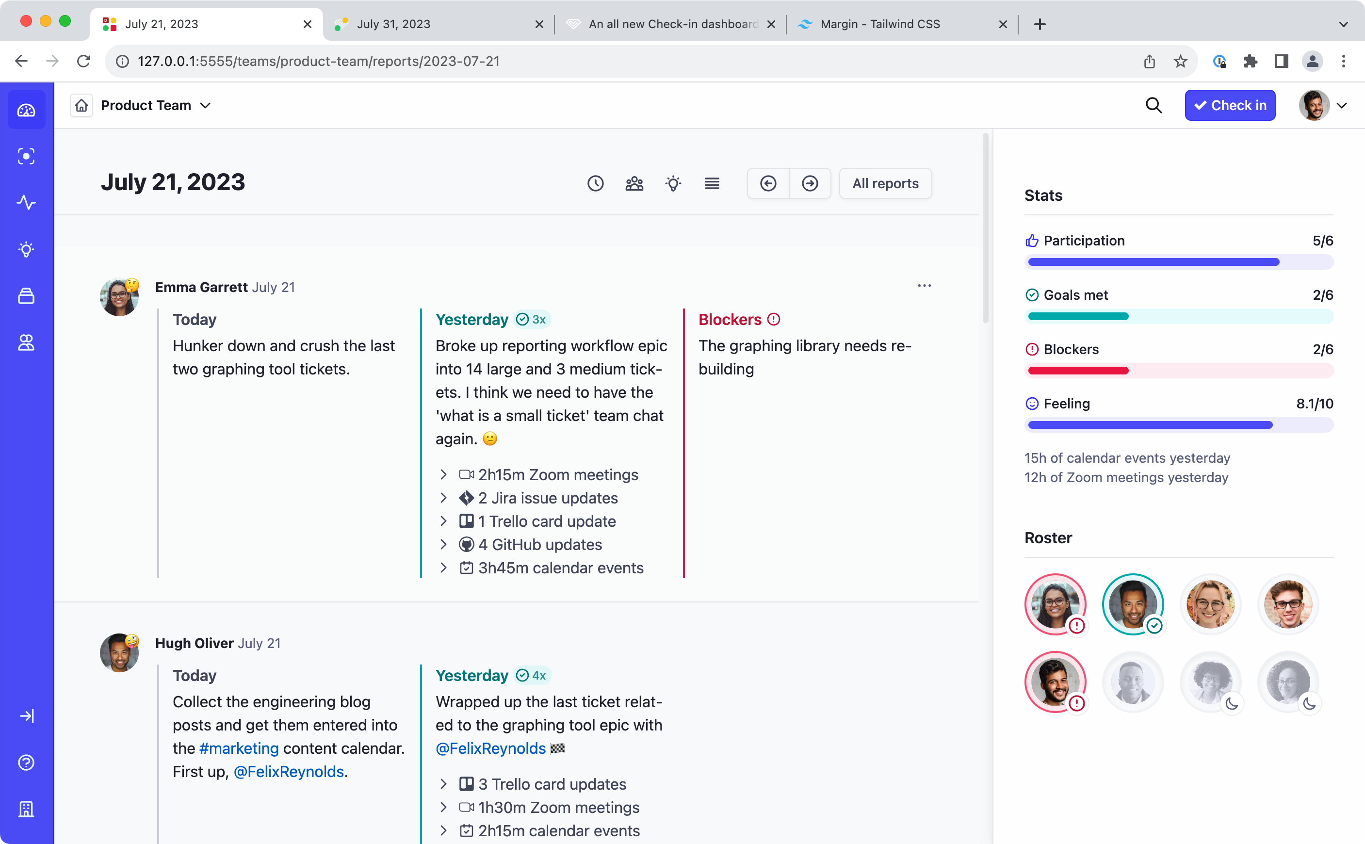
While we were at it, we sanded down some rough edges and worked on reducing noise and clutter. Integration activity is included in the yesterday/previous block now, which makes when that activity happened more explicit, and improves the activity-as-check-in experience for teams that use it. Activity blocks look more like the toggle-able groups that they are, and iconography for completions and blockers move to their specific sections instead of overloading the avatar.
Even more good stuff
The updates to the Check-in dashboard are just the tip of the iceberg; we made a host of other improvements that make Status Hero better.
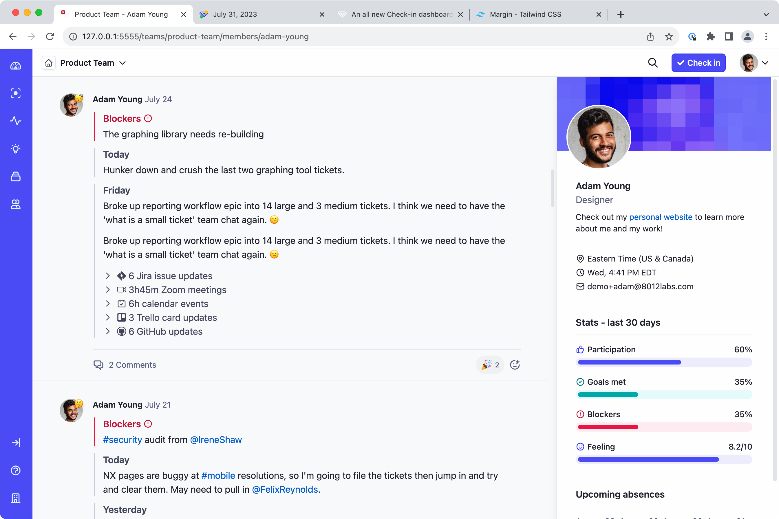
All new member profiles
Member profiles got a big update, bringing in the new Check-in layout and a totally revamped sidebar that displays useful information; a rich text bio, their location and current time, contact info, etc.
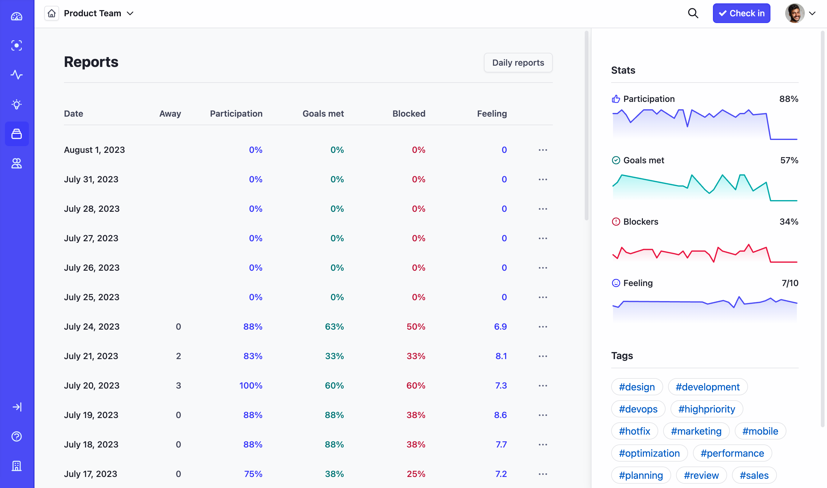
Updated Reports
For Reports, we changed how we’re reporting on trends. They’re displayed individually on the sidebar now, which makes them easier to read and explore:
Updated Insights
Insights gets the same new Check-in layout options as the dashboard:
Integrated absences
Before, planned absences were displayed as a small line of text at the bottom of the dashboard, which made them easy to miss. Now, absences are displayed in both the new roster section, and in the primary column alongside the rest of the check-ins. It makes absences impossible to miss, and the inclusion of return dates and integration activity makes them even more useful.
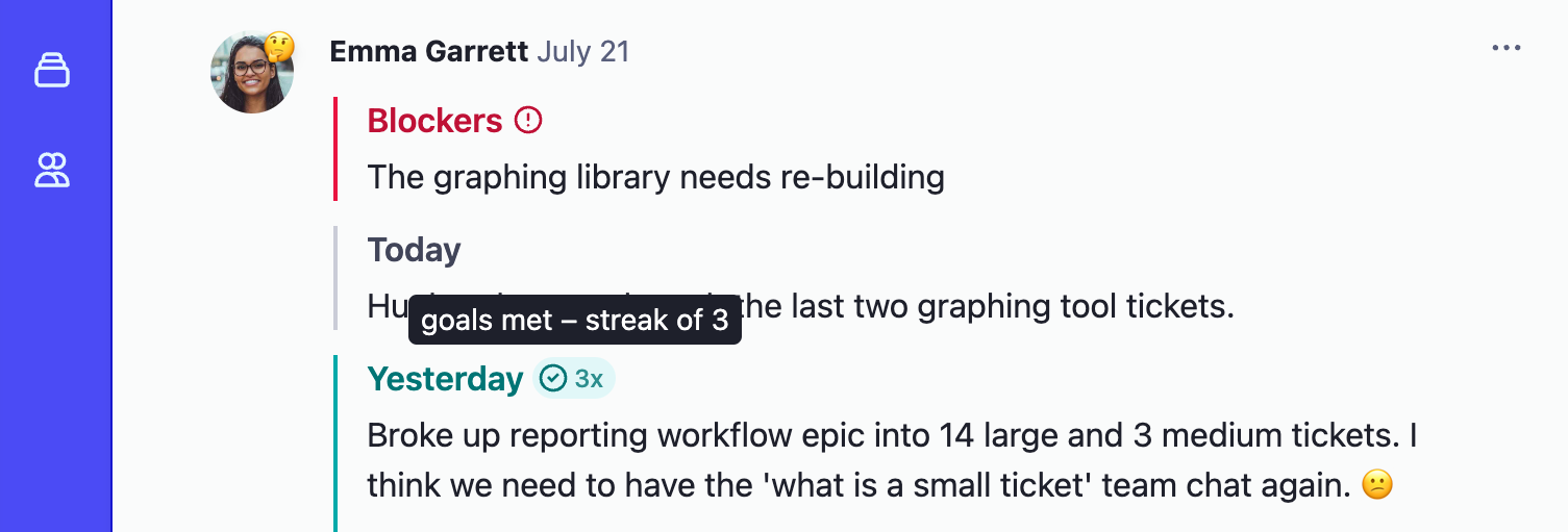
More impactful goal streaks
Before, we showed check-in completion streaks using a fire icon, with a few different colors to indicate higher quantities. The flame lives on in the roster hover cards, but we’ve updated the primary display to focus on a raw count. It requires less interpretation, and makes streaks more meaningful; a streak of 50 doesn’t look near identical to a streak of 5.
Visual updates and polish
You’ll notice some tweaks to the app colors, and minor visual refinements to things like the sidebar. This brings the app and our updated brand identity into closer alignment, and reduces some visual noise across the app. We’re always working on making Status Hero work great and feel great.
P.S. if you like riding the bleeding edge, open up Status Hero in Chrome Canary with the view transition flags enabled (chrome://flags#view-transition, and chrome://flags#view-transition-on-navigation), and navigate through Check-in reports 😎
